8 Vintage T Shirt Design Ideas for POD
You've got the right instinct: a vintage shirt should feel like it has a past, but the artwork still needs to be yours, printable, readable, and safe to sell. A faded texture alone won't carry a weak concept. The stronger vintage t shirt design ideas combine a recognizable visual system with a specific audience hook, a controlled palette, a clear thumbnail, and wording that has survived a trademark check.
That balance matters because the style has a long commercial history. The plain T-shirt began as late-19th-century workwear and undergarment, entered the U.S. Navy uniform in 1913, and became closely associated with graphic imagery during the 1960s as screen printing improved and rock-and-roll and hippie culture spread. Barbara Hulanicki helped move the format into high fashion in 1964, followed by designer lines in the 1970s through Vivienne Westwood, which helped make vintage style both nostalgic and fashion-led (Muse Magazine's graphic T-shirt history).
The eight concepts below are organized by visual system, not by a loose list of eras. Each includes print decisions, niche adaptations, sample wording, mockup advice, and a practical way to validate the direction in Trendlytic. Trendlytic researches live bestseller patterns across TeePublic, Amazon Merch, Redbubble, and Etsy, and its built-in USPTO trademark check helps screen names and phrases before publishing.
Table of Contents
- 1. Retro Typography with Distressed Effect
- 2. Vintage Illustration with Line Art
- 3. Retro Color Blocking with Geometric Shapes
- 4. Vintage Badge or Patch Style
- 5. Faded Photo or Halftone Vintage Image
- 6. Retro Script and Flourish Typography
- 7. Vintage Band Logo Homage Without Copyright
- 8. Retro Packaging or Product Label Design
- 8-Point Comparison of Vintage T-Shirt Design Ideas
- Turn the Strongest Concept Into a Safer Test
1. Retro Typography with Distressed Effect
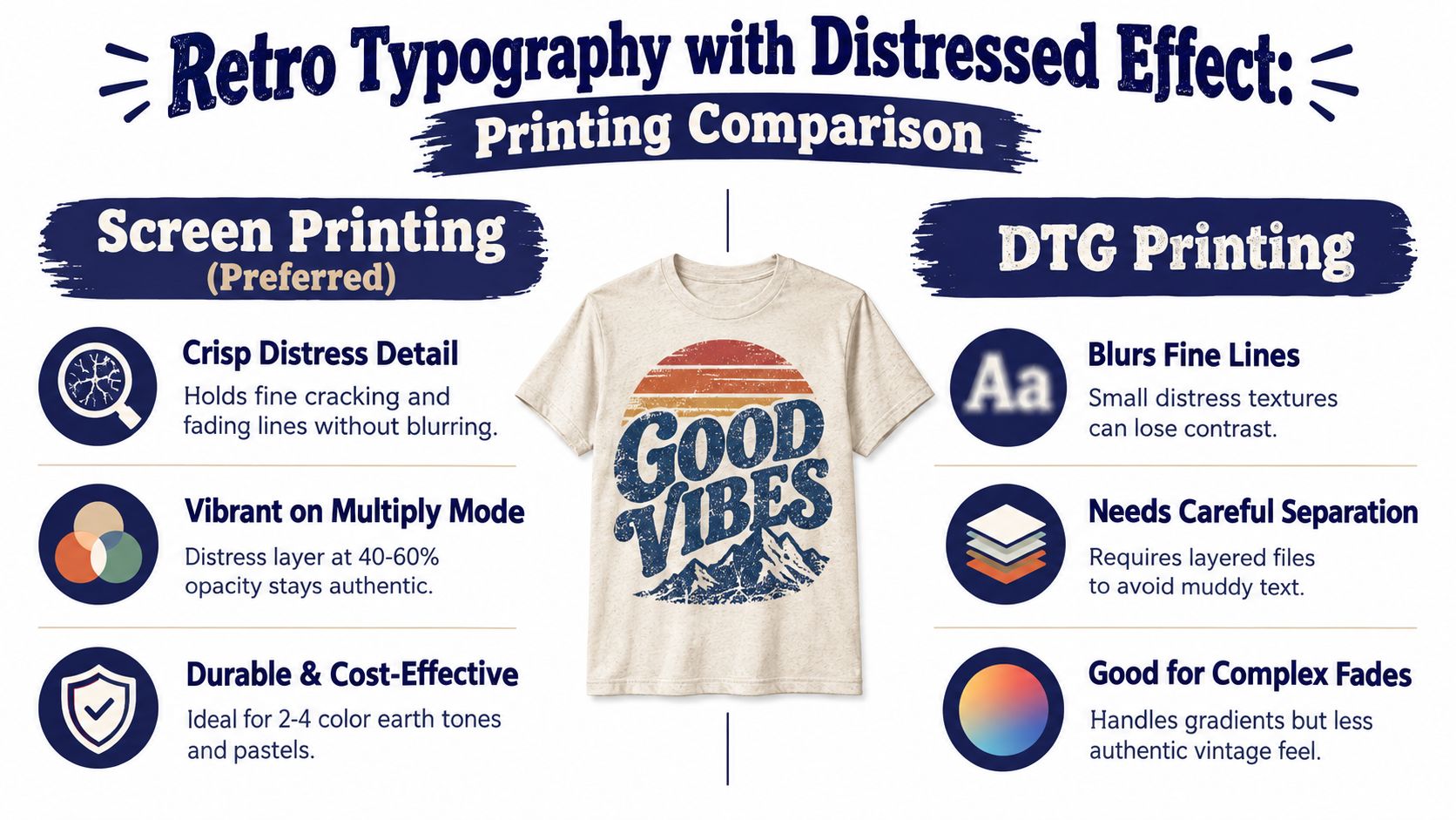
Large type does most of the work here. Choose a bold display face that recalls the 1970s through 1990s, then add controlled wear marks, faded edges, uneven ink coverage, and a little hand-drawn geometry. The contrast between structured letterforms and irregular distressing creates age without making the shirt look careless.
A fictional ski lodge, for example, could use “NORTHSTAR SKI CLUB” in oversized arched lettering, with a small mountain line beneath it and a weathered cream print on a washed navy blank. A national-park-inspired version might say “HIGH COUNTRY TRAIL CREW,” but the location, wording, and emblem should be original rather than copied from an official identity. Commercial references such as vintage Coca-Cola varsity graphics can help you understand the visual language, but they aren't safe material to reproduce.
Practical rule: Distress the ink, not the message. If the main phrase becomes difficult to read, the texture has gone too far.
Build the file in separate layers
Keep the base text, texture overlay, and color elements separate in Photoshop. That makes it easier to remove distress from small supporting text or produce light and dark garment versions without rebuilding the artwork.
Test the design at roughly a 2 × 3 inch viewing size on a phone mockup. A strong typography concept should remain identifiable at that scale. The custom T-shirt printing market was valued at about $4.57 billion to $7.01 billion in 2025, and screen printing represented about 41% to 51.8% of production volume, while digital printing was growing at about 12.5% CAGR, according to market data on custom T-shirt printing. That mix makes simple, layered artwork practical for both screen-print and DTG or DTF workflows.
Use Trendlytic to search “retro typography” and “70s font.” Compare the strongest designs across each marketplace, paying attention to niche wording, garment color, placement, and whether the concept is stable or tied to a short-lived phrase. The platform's trending shirt designs research can also help you identify recurring retro layouts before you create your own version.
Before publishing, screen vintage band names, defunct brands, slogans, and location phrases through a trademark search. Nostalgic wording can still identify a protected brand.
2. Vintage Illustration with Line Art
Line art gives vintage apparel a quieter, more editorial character. Instead of asking the buyer to read a slogan, it lets the illustration carry the identity. Botanical studies, anatomical sketches, astronomy diagrams, and pen-and-ink animals all work because they suggest a reference-book or field-guide tradition without needing a direct historical reproduction.
A mushroom and wildflower design could target foragers with the phrase “WOODLAND SPECIMENS” in small serif type. An anatomical heart could become “FIELD NOTES IN FEELING,” provided the drawing is original and the scientific labels are created from your own research. For an astronomy audience, a simple moon phase diagram with “NIGHT OBSERVATION CLUB” may feel more specific than a generic star graphic.
Protect the clarity of fine lines
Fine detail is the main trade-off. A shirt can look elegant in Illustrator and turn muddy in a product preview if the line weight is too delicate. The planned artwork should use lines at least 1.5 pt at final print size, then be tested on a grayscale mockup before color is introduced. Export vector artwork as PDF or EPS when possible, or use a 300 dpi PNG at the final dimensions. Don't scale a small raster image upward.
- Use one or two ink colors: Black and cream, or dark green and muted gold, usually preserve the study-plate feeling better than a crowded palette.
- Leave open space: Dense shading can make a botanical design look like a dark patch from a distance.
- Check the reference: Use original observation or commercially licensed, royalty-free reference material rather than embedding a copyrighted illustration.
Trendlytic's trending rankings can help compare categories such as mushrooms, wildflowers, animal portraits, and astronomy. Look for the audience phrase attached to the artwork. “Mushroom shirt” is broad, while “foraging club,” “herbal study,” or a local nature group gives the same visual system a clearer buyer.
A grayscale test is especially useful for marketplace thumbnails. If the design only works because of a subtle color contrast, it may disappear on mobile. The illustration should still communicate its subject in black and white.

For adjacent visual storytelling, a short vintage cartoon video resource can help you study how simplified line, expression, and silhouette communicate without overloading the frame. Keep the final shirt artwork original.
3. Retro Color Blocking with Geometric Shapes
This system uses geometry instead of texture as the main signal. Think of stacked arches, offset rectangles, triangles, semicircles, and horizon bands arranged like a 1970s album cover or an abstract travel poster. The layout can be contemporary, while the palette places it in a recognizable retro world.
A surf-skate design might combine a dusty blue semicircle, burnt-orange sun, and cream wave with the phrase “COASTAL NIGHT RIDERS.” A ski version could use three angular mountain blocks and a small lodge name. For a design audience, an abstract composition with “FORM FOLLOWS FUN” may be stronger than a literal illustration because the visual structure becomes the product.
Control color and registration
Start with one anchor color in Adobe Color or Coolors, then build a restrained palette around it. Useful vintage combinations include burnt orange with avocado, mustard with dusty blue, or rust with cream. The exact combination matters less than the contrast and the relationship between large shapes.
Build each shape on its own Illustrator layer. That lets you adjust the design for light and dark garments and makes production troubleshooting easier. Ask the printer about registration tolerance before using narrow gaps between adjacent shapes. A small misalignment can expose the fabric and create an unintended white line.
A color that looks rich on a monitor can print flatter or darker. Make an actual-size paper proof before approving the final file.
Trendlytic searches for “retro color block” and “70s geometric” can reveal which audience terms sit beside the visual style. Compare abstract sunsets, ski graphics, surf graphics, and minimalist home-design concepts rather than treating “retro” as one market. Trendlytic's print-on-demand design research guide is useful for structuring that comparison across marketplaces.
A practical niche adaptation is to place one specific word inside a familiar form. Put “BEND,” “MUSHROOM,” or “NIGHT SWIM” inside a sunset arch, then test related phrases rather than changing the entire composition. A palette generator for adult coloring can also help you explore combinations, but the final choice should be checked against the garment color and print method.
4. Vintage Badge or Patch Style
Badges work because they contain the whole idea. A circular, shield, hexagonal, or ribbon-framed design gives the eye an immediate boundary, which makes the shirt feel like a club artifact rather than a random graphic. Old scouting patches, sports emblems, travel decals, brewery marks, and workwear logos provide useful structural references.
An original example might read “OLD TRAILS HIKING CLUB” around a mountain and forest, with “EST. 1979” as supporting text. A tavern concept could use “BACKROAD SUPPER SOCIETY” around a fork, campfire, or roadside sign. The wording creates the audience identity. The distressed finish only reinforces it.
Design for a clean outer silhouette
Use Illustrator's Circular Type tool to wrap text around the border, then adjust kerning manually. Build the badge at 150% to 200% of final print size so small ornaments and curved lettering are easier to refine. At final size, remove any detail that becomes a gray blur.
A badge can suit several production methods, but the artwork should account for the difference between a printed emblem and actual embroidery. If you're selling a POD print, don't imply thread texture unless the product offers it. A simulated stitch border may look convincing in a mockup but can feel misleading if the listing describes it as embroidery.
- Location badges: Use an original town or trail concept, then screen the name before listing.
- Hobby badges: Replace generic “outdoor” language with a specific activity, such as trail maintenance, fly tying, or night hiking.
- Food and drink badges: Use fictional tavern or brewery names, not a real business identity.
North America holds about 35% to 38% of the vintage apparel and graphic T-shirt market, while Asia-Pacific is identified as the fastest-growing region in the cited market analysis (regional vintage T-shirt demand data). That doesn't guarantee a badge will sell, but it supports testing location, travel, and outdoor identities where the format already feels natural.
Mock up the badge on a muted blank, with one centered front view and one close crop showing the print texture. If you're testing physical production, request a sample before describing metallic ink, thread, or specialty finishes.
5. Faded Photo or Halftone Vintage Image
Halftone creates the impression of a photograph reproduced through an older print process. The image becomes a field of dots, usually in black, sepia, rust, or a single muted ink. A travel landmark, old vehicle, fictional newspaper clipping, or original portrait can gain visual history without requiring a complicated full-color illustration.
For example, a shirt for a road-trip audience could show an original halftone illustration of a roadside motel with “VACANCY FOR THE RESTLESS.” A photography club might use a camera still life and the phrase “DARKROOM SOCIAL.” A historical theme can work too, but don't assume an old-looking source image is free to use.
Make the source and rights part of the design process
Increase contrast before applying a halftone filter in Photoshop. Soft, low-contrast imagery tends to produce muddy dots, especially on dark garments. Adjust dot size and pattern through a dedicated halftone filter rather than applying a preset and accepting the result unchanged.
Check copyright, trademark, and publicity rights with care. A celebrity photograph, recognizable brand, landmark logo, or historical image from an unknown source can introduce risk even if you've altered it. Use original photography, licensed assets, or material you've verified for commercial use.
The source file should be at least 300 dpi at final print size. Test the halftone on both light and dark shirts because dot visibility changes with the garment beneath the ink. A sepia image that looks balanced on cream may lose its midtones on charcoal.
Trendlytic can help you compare whether a photo-led concept is being discovered through travel, nostalgia, vehicles, music aesthetics, or local identity. Search the subject and the visual treatment separately. “Vintage motel,” “halftone travel,” and “retro roadside” may expose different audiences even when the image system remains similar.
Use one front-facing mockup with the full composition and one close crop that shows the dot pattern. The crop is important because buyers need to see that the roughness is intentional, not a low-resolution failure.
6. Retro Script and Flourish Typography
Script typography changes the emotional register of vintage apparel. It can suggest an old wedding invitation, an apothecary label, a hand-painted tavern sign, or a 1970s lifestyle poster. The style suits buyers who want something decorative and personal rather than loud and athletic.
A fictional apothecary shirt might say “SLOW MORNING REMEDIES” in flowing script with a small botanical sprig. A bridal design could use “THE FOREVER CLUB” with the event name in a restrained sans-serif underneath. For a bohemian audience, “WANDER GENTLY” paired with two leaves may work better than filling the shirt with multiple decorative phrases.
Keep the lettering readable
Script is easy to overwork. Choose one dominant face, then pair it with a simple sans-serif for location, date, or supporting copy. Hand-drawing the primary flourish and digitizing it can give the design a more convincing irregularity than combining several stock swashes.
Use only a few major flourishes. Three or four deliberate accents usually create a stronger frame than a continuous tangle of loops. Test the script at several sizes and on a phone mockup. Thin connections often disappear when the design is reduced.
A practical Trendlytic workflow starts with “script design” and “bohemian typography.” Compare the words used in titles and tags, but look for an audience you can name clearly: bridal parties, herbalists, vintage cocktail enthusiasts, yoga communities, or old-signage collectors. Then create a phrase that belongs to that audience rather than copying a popular quote.
The mockup should show the garment texture. A soft cream or garment-dyed green blank can support the lifestyle feeling, while a bright white shirt may make the same script look more like wedding stationery. Use one clean front image and one angled image to show how the flourishes sit across the chest.
Script designs also need a trademark check. A phrase may sound generic but still function as a brand identifier in apparel, especially when paired with a distinctive business or club name.
7. Vintage Band Logo Homage Without Copyright
Band-style artwork has strong cultural shorthand, but the safest route is to borrow the era's visual grammar, not its protected identity. Use a fictional band name, original lettering, invented tour locations, and artwork that doesn't reproduce a real logo, album cover, member likeness, or recognizable symbol.
A fictional metal project could use “IRON HARVEST” in angular block lettering with imaginary venues on the back. A punk-inspired shirt might say “STATIC PARADE” with a rough photocopy treatment and invented city names. An airbrush-style design could center on an original desert creature, motorcycle, or satellite rather than a real performer.
Test whether the homage has become a copy
Study real band merchandise to understand proportion, contrast, lettering density, and back-print conventions. Then put the references away and draw your own system. Avoid real band names, real tour dates, member references, song lyrics, and logos. The design should still make sense if the viewer has never heard the source bands.
Ask someone unfamiliar with the inspiration to review the artwork. If they immediately identify one specific band rather than the broader era, revise the lettering, icon, or layout. That doesn't replace legal advice, but it's a useful creative warning.
Trendlytic searches for “band logo style” and “tour merch design” can help you compare eras and niche language across TeePublic, Amazon Merch, Redbubble, and Etsy. Use validated designs to understand demand signals, not as tracing references. The market analysis cited earlier found that vintage band tees represented 29% of top categories, and original vintage-style designs reportedly outsold authentic band merchandise by 3.2 times, according to the cited vintage graphic T-shirt analysis. Treat those figures as directional evidence from that dataset, not a promise for an individual listing.
Run every fictional name and phrase through Trendlytic's integrated trademark checker before finalizing. The platform's discussion of trademark protection for Merch by Amazon is a useful reminder that a design can be visually original and still create problems through its wording.
Mock up the shirt on washed black or charcoal, then show the back print separately. Band-style designs often depend on a front mark and a larger back composition, so a single front-only image won't explain the product properly.
8. Retro Packaging or Product Label Design
Packaging parodies give vintage design a built-in hierarchy. The product name is large, the descriptive copy supports it, and small details create the pleasure of discovery. Cereal boxes, detergent labels, beauty products, diner goods, and old energy drinks all offer structures that can become an original shirt.
“Vintage Anxiety Cereal” is a clear example. The front could include fictional ingredients such as overthinking, unread messages, and premature worry, with a made-up mascot and a period-appropriate nutrition panel. A beauty label might say “SUNDAY FACE POWDER,” while a fictional detergent could promise “FRESHLY WASHED NOSTALGIA.”
Make the joke specific and legally distinct
The strongest packaging shirts don't recreate a real brand's colors, wordmark, mascot, and layout. They use the general conventions of the category, then change the name, product promise, illustrations, and visual structure enough to establish a separate identity. A cereal parody that still looks like one specific commercial box may invite unnecessary risk.
Use Pinterest or Google Images to study genuine packaging layouts, but don't copy a particular package. Write period-appropriate copy in your own voice. Keep the hierarchy obvious:
- Product name: The largest element, readable in the thumbnail.
- Descriptor: A short phrase that explains the joke or niche.
- Supporting copy: Ingredients, usage notes, or fictional claims that reward closer inspection.
- Fine print: Keep it sparse enough to remain printable and legible.
Trendlytic searches for “package design” and “cereal box shirt” can show whether buyers respond more to food humor, self-care language, nostalgic household goods, or design-industry jokes. Compare tags and titles across the four marketplaces, then create several phrases within the same packaging system.
DTG is usually the practical choice when the label contains small text, multiple colors, or subtle texture. If you simplify the design to a few bold shapes and larger type, screen printing becomes more realistic. Mock up the shirt both as a full front view and as a close crop. The full view establishes the packaging silhouette, while the crop proves that the joke can be read.
Finally, check every fictional brand name and product phrase. Parody intent doesn't automatically remove trademark concerns.
8-Point Comparison of Vintage T-Shirt Design Ideas
| Design Style | 🔄 Implementation Complexity | ⚡ Resource & Printing Requirements | ⭐📊 Expected Outcomes | 📊 Ideal Use Cases | 💡 Key Advantages / Tips |
|---|---|---|---|---|---|
| Retro Typography with Distressed Effect | Low–Medium: typography-first; requires careful distress layering | Screen printing preferred; DTG possible with distress at 40–60% opacity; 2–4 colors | High visibility; thumbnail-friendly; broad demographic appeal | POD marketplaces, streetwear, evergreen retro collections | Distressing masks print flaws; separate text/distress layers, test at small scale, check trademarks |
| Vintage Illustration with Line Art | High: demands strong hand-drawn skill and line-control | Screen printing 1–2 color preferred; DTG ok at 300dpi; export as vector/PDF | Premium editorial feel; converts well on higher-end platforms | Etsy, boutiques, accessory expansion (bags, cases) | Keeps crisp over time; ensure lines ≥1.5pt, use high-res vector exports |
| Retro Color Blocking with Geometric Shapes | Medium: composition and color theory critical; registration sensitive | Screen printing ideal (3–4 screens); DTG workable but loses separation | High contrast and feed-ready; trend-driven popularity | Modern-retro collections, thumbnails, album/graphic homages | Use palette generator, keep shapes on separate layers, test registration tolerance |
| Vintage Badge or Patch Style (Emblem Design) | High: precise kerning, contour text and ornamentation required | Screen printing 2–4 colors; optional metallic/puff inks; DTG loses metallic look | Perceived premium and collectible; strong focal branding | Chest badges, park/club emblems, branded merch | Create at 150–200% size, wrap text with circular tool, trademark-check names/places |
| Faded Photo or Halftone Vintage Image | Medium: source clearance + halftone setup; dot-size tuning needed | DTG optimal for halftone/grayscale; screen printing risks dot fill | Instant nostalgia; appeals to archival/history audiences; novelty sells | Photo-based merch, retro editorial tees, limited runs | Use halftone filter, increase contrast before halftone, ensure 300dpi and clear rights |
| Retro Script and Flourish Typography | High: script choice and authentic hand-drawn swashes essential | Screen printing 2–3 colors; metallic inks possible; DTG lacks metallic effects | Perceived luxury; niche bohemian/lifestyle appeal; higher price points | Bridal/boho collections, premium lifestyle brands | Hand-draw main flourishes, test readability at multiple sizes, limit swashes to avoid clutter |
| Vintage Band Logo Homage (Without Copyright) | Medium–High: emulate era while avoiding infringement | Screen printing 1–2 colors for authentic feel; DTG acceptable | Strong nostalgia and music-fan appeal if clearly original | Tour-style tees, music-inspired drops, merch lines | Use fictional names/dates, run trademark checks, test with uninformed viewers for originality |
| Retro Packaging or Product Label Design | High: multi-element layout, typography and copywriting required | DTG preferred for multi-color/detail; screen printing ok for simplified versions | Highly shareable and giftable; trend-sensitive and time-bound | Parody/humor tees, niche gift markets, social-share designs | Mimic period layouts for authenticity, keep text hierarchy clear, perform trademark review |
Turn the Strongest Concept Into a Safer Test
Eight ideas are too many to launch as one undifferentiated collection. Narrow them to one or two concepts by asking four practical questions. Does the visual system fit a specific audience? Can your chosen print method reproduce it cleanly? Is the wording original enough to stand apart? Does the design remain understandable in a small marketplace thumbnail?
Vintage is broad, but demand is increasingly fragmenting into narrower micro-aesthetics. Current trend roundups highlight Y2K chrome and metallic text, 1970s sunset graphics, coastal vintage surf-skate, bootleg-style photo shirts, and vintage toy nostalgia rather than one universal retro look (2026 Etsy-oriented design trend ideas). Other trend coverage points to metallic graphics, holographic effects, chrome lettering, early internet imagery, hand-drawn imperfect lettering, and faded distressed printing (retro and vintage T-shirt trends). That's a useful reason to choose a narrow audience, not a reason to add every trend to one shirt.
Start with a phrase that identifies the buyer. “Retro shirt” is a visual description, not a niche. “Night Hike Society,” “Coastal Repair Club,” “Analog Photography Department,” or “Small-Town Roller Rink” gives you a person, activity, or place to research.
A grounded validation sequence
- Search the phrase in Trendlytic: Start with the exact niche phrase, then try adjacent terms that describe the audience and visual system.
- Compare all four marketplaces: Review TeePublic, Amazon Merch, Redbubble, and Etsy separately. A concept that looks crowded on one platform may have a different competitive context on another.
- Study validated designs: Look at titles, tags, pricing, garment colors, placement, and recurring visual structures. Treat those patterns as market language, not material to copy.
- Check the opportunity signals: Trendlytic reports demand and competition levels, an Opportunity Score, and validated designs with images, tags, and pricing. Use those outputs to decide what deserves a design test.
- Run the wording through trademark screening: Trendlytic checks keywords against 850,000+ active USPTO trademarks, flagging ownership and expiry information, according to Trendlytic's platform description. Use that as an early screen, then seek qualified legal advice when a name or phrase remains uncertain.
- Make a small mockup set: Show the same artwork on a light blank, a dark blank, and a washed or garment-dyed option. Include a full view and a mobile-sized crop.
- Record each change: Note what changed between versions, including phrase, font, palette, distress level, placement, and garment. Without that record, it's difficult to know which variable influenced a later result.
The broader retro fashion category provides context for why this work remains relevant. One 2025 report valued the global retro fashion market at $45.2 billion and projected it to reach $78.3 billion by 2034, with apparel representing 42.3%, or $19.1 billion, in 2025 (retro fashion market report). Those figures describe a broad market, not a guaranteed POD outcome. Your listing still has to connect a distinct audience with a credible product and a clear image.
Product authenticity deserves equal attention. Vintage is moving beyond a graphic filter toward garment-level signals such as garment dyeing, discharge ink, crackle additives, thicker neckbands, dropped shoulders, and washed fits, as discussed in current T-shirt design guidance. A convincing print on the wrong blank can feel less authentic than a simpler design on a better-matched shirt.
For trademark screening, start with the apparel category, commonly USPTO Class 25, and remember that sellers operating a retail or ecommerce store may also need to consider Class 35. Related classes such as 18 and 35 can create conflicts, so searching only Class 25 is not enough, according to clothing trademark guidance.
I'd choose the concept with the clearest audience and the least complicated production file, then make several controlled variations rather than eight unrelated designs. Trendlytic can reduce the manual research involved in comparing live marketplace patterns, but research can inform a test. It can't guarantee sales, and it can't replace original design judgment, rights checks, or product-quality testing.
Trendlytic helps POD sellers research vintage niches across TeePublic, Amazon Merch, Redbubble, and Etsy, with validated designs, demand and competition signals, and an Opportunity Score. If you want to spend less time comparing marketplace results manually, explore Trendlytic before choosing your next vintage shirt direction.