10 Trending Design Examples for POD Sellers in 2026
You can spend an hour on a bestseller page and still feel like you're seeing the same five ideas over and over. I know that loop well, because it's how most POD sellers end up studying trending design in practice, not in theory. The point isn't to chase every style that looks active. It's to understand which visual patterns keep showing up, why buyers keep clicking them, and what has to be checked before you turn one into your own listing.
I treat this list as a working field guide, not a forecast. Every example below needs a trademark check, a look at the actual product fit, and a decision about whether the design can stand on its own without leaning too hard on someone else's success. Some styles are easy to launch and hard to protect. Others are harder to execute but safer to own. Each one comes with the trade-offs I'd look at before putting it on Etsy, Redbubble, TeePublic, or Merch on Demand.
Table of Contents
- 1. Minimalist Typography And Quote Design
- 2. Retro And Vintage Aesthetic
- 3. Personalized And Customizable Designs
- 4. Oversized And Statement Graphics
- 5. Sustainable And Eco-Conscious Design Messaging
- 6. Anime And Manga-Inspired Designs
- 7. Micro-Niche And Hyper-Specific Designs
- 8. Hand-Drawn And Organic Illustration
- 9. Inclusive And Representation-Focused Design
- 10. Interactive And Augmented Reality Design Concepts
- 10 Trending Design Styles Compared
- Turning a Trend Into Your Own Original Design
1. Minimalist Typography And Quote Design
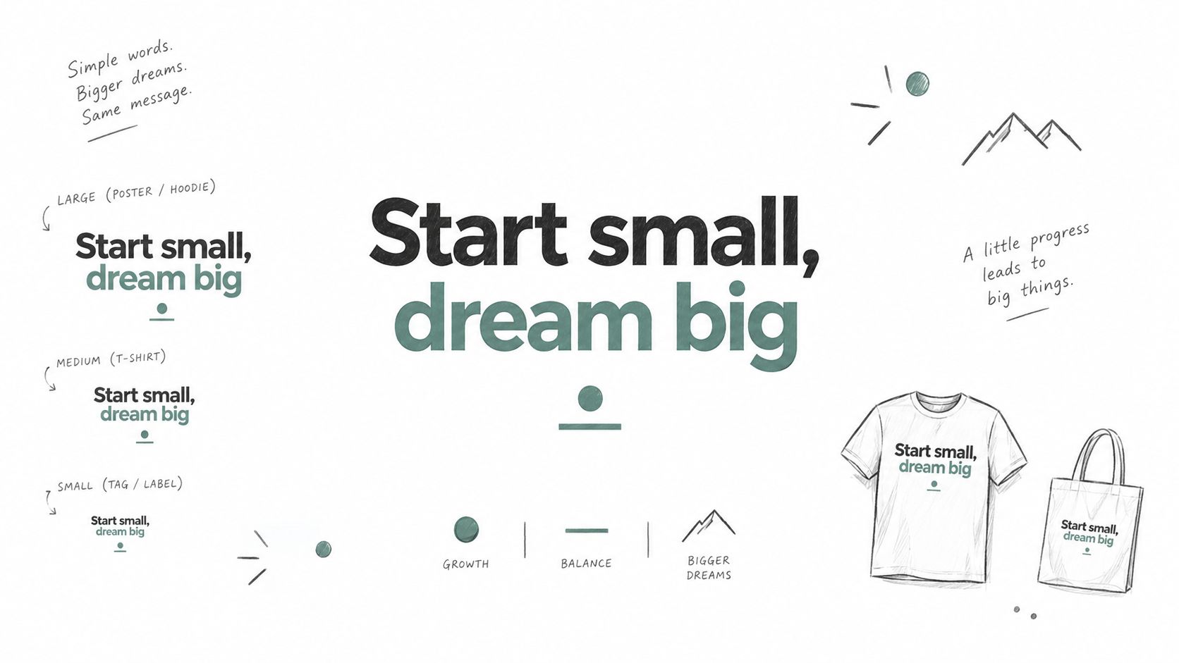
Minimalist quote work is still one of the easiest styles to test because it reads fast and stays clean on shirts, hoodies, mugs, and stickers. On Etsy, a phrase like “Coffee is my love language” can work when the niche is specific. On Merch by Amazon, short motivational fitness lines keep appearing. On Redbubble, community jokes for book lovers or cat parents fit the format naturally. The design sells when the wording is tight, the type has weight, and the spacing looks intentional.
Why It Sells
Typography-first work gives buyers a quick read in a thumbnail and still looks deliberate when printed small. It also lets me test one idea across different blanks without wrestling with complex artwork or too many colors. A strong phrase with clear hierarchy can carry the product on its own.
Practical rule: if the quote can't be read in a tiny mockup, it won't help you on a crowded marketplace page.
The main trap is familiar. Common phrases can still have hidden ownership. Before launch, I would run the exact wording through a USPTO trademark check and compare live marks in related apparel categories, not only the exact phrase. The restraint that works here is the same discipline behind good minimalist tattoo ideas, where a single strong line carries the whole composition. Trendlytic is useful here because its store-first view shows which quote styles are already paired with products that sell, rather than ideas floating without a listing. I also test multiple font pairings on real mockups, because what looks balanced in design software can fall apart on fabric.
A small icon, shape, or divider often helps more than extra decoration. A coffee cup, paw print, dumbbell, or geometric line can give the quote a visual anchor without turning the layout into clutter. The best version is easy to read, easy to print, and easy to defend if someone asks whether the phrase can stay safely in your catalog.
2. Retro And Vintage Aesthetic
Retro keeps coming back because nostalgia is easier to sell than novelty when the execution feels authentic. I see this most often in 80s neon band-style pieces on Redbubble and Merch by Amazon, vintage national park poster looks on Etsy and Amazon, and 90s grunge tees on TeePublic. The same idea shows up in retro game art too, especially when the seller uses references that feel rooted in the era instead of copied from another shop.
I pay more attention to color and texture here than to the theme itself. A cassette, lightning bolt, distressed type, or sun-faded poster treatment can work, but only if the palette fits the product blank. What pops on a screen can look muddy on a dark shirt, and that's where a lot of retro listings lose impact.
A good example is a poster-style tee with worn inks, a muted sunset palette, and a simple headline that feels like old travel merch. It sells because it looks familiar without being a direct replica of a known property. The second it drifts into band names, film titles, or other protected branding, it becomes a different conversation entirely.
Use Trendlytic's live bestseller data to see which retro substyles are moving, because not every 80s reference carries the same demand. I'd also check the USPTO database for anything that sounds like a band name, movie title, or branded phrase before building a whole series. If I'm sourcing references, I want genuine era material, not modern nostalgia made to look old.
The internal guide on art that sells on Etsy is relevant here because retro work often succeeds when the seller treats it like a product system, not a one-off design.
3. Personalized And Customizable Designs
Personalization still works because people will pay more when the item feels made for them, not just customized in a lazy way. On Etsy, family name pieces stay strong, and wedding, anniversary, pet portrait, and team-name products all fit the same logic. The winning version usually gives buyers a few clear options, not a blank canvas that turns into a support headache.
Where It Breaks
The biggest problem is ambiguity. If the buyer doesn't know what can change, they'll ask questions, or worse, order the wrong version and blame the listing. I keep the base design simple so the customization doesn't crush the layout, and I make the input rules painfully clear.
A good personalized listing answers the buyer's first question before they click add to cart.
That means I'd spell out exactly what changes, what doesn't, and how the proof or preview works. A simple mockup preview helps here, because buyers can see whether the family name, date, or pet details fit the composition. If the product is built around a niche like book lovers, the internal reference on book lover merchandise helps frame how a narrow audience can still support premium customization.
The trademark issue gets trickier with personalized products, not easier. I still check the base phrase separately, because adding a name doesn't clean up a protected slogan or branded structure. Trendlytic helps me spot which niches already respond to personalized products, so I'm not trying to force customization into a space that doesn't support it.
4. Oversized And Statement Graphics
Oversized graphics sell when the buyer wants the garment to look like the design came first and the shirt came second. I see this in large character art on Redbubble, full-back graphics on Merch by Amazon, and oversized abstract or streetwear-inspired art on Etsy. These pieces work well for fashion-forward buyers who want the shirt to feel bold from across the room.
The challenge is placement. A huge design that looks sharp in a file can sit awkwardly on a real tee if the edges crowd the seams or the center line lands badly on the chest. Mockups matter more here than anywhere else, because proportion is the product.
I usually test at least three placements before I settle. Centered works for statement typography, asymmetrical placement gives more movement, and full-back graphics can create a stronger streetwear feel. Different audiences read those placements differently, so I don't assume one layout fits every niche.
What To Check Before Launch
- Resolution First: oversized designs expose every weak edge, so the source art has to be clean and high resolution.
- Blank Product Fit: the same graphic can feel sharp on a premium tee and clumsy on a cheaper blank.
- Negative Space: leave room around the art so it doesn't feel cut off or overly cramped.
- Audience Style: some niches want subtle branding, others want the shirt to announce itself immediately.
Trendlytic is helpful here because I can compare whether a category is leaning toward bold statement pieces or quieter layouts before I commit. That saves me from pushing oversized work into a niche that's clearly buying simple, compact graphics instead.
5. Sustainable And Eco-Conscious Design Messaging
Eco-conscious designs work best when the message and the product match. Ocean conservation tees, climate action messaging, sustainable living graphics, and wildlife protection visuals all show up across Redbubble, Etsy, and Merch by Amazon, but the listings feel more credible when the material choice supports the story. If the copy sounds ethical while the product feels cheap, buyers notice.
I'm careful with language here. “Eco-friendly” by itself is vague, and vague is often read as greenwashing. I prefer specific themes, like conservation, anti-fast-fashion, reuse, or nature protection, because the buyer can understand what the design stands for without needing a polished slogan.
The product choice matters just as much. If I'm using organic cotton or recycled materials, I want the listing to reflect that clearly and transparently. If I can't support the claim operationally, I'd rather keep the message visual and values-based than make promises the product can't back up.
The sustainability angle also needs a trademark check. Environmental organizations, campaign names, and symbol-based identities can carry more risk than they look like they should. I'd also think about whether a donation partnership or real-world alignment makes sense, because buyers who care about the subject usually care about credibility too.
Trendlytic can help identify which sustainability niches are getting actual demand instead of generic interest. That matters because not every environmental theme converts the same way, and the wrong one can feel more like a lecture than a product.
6. Anime And Manga-Inspired Designs
Anime-inspired work has strong community energy, but it's also one of the easiest places to step into rights trouble. I see it in fandom-driven pieces on Merch by Amazon and Redbubble, in niche subgenres like isekai, magical girl, or mecha, and in original work that borrows the visual language without copying a character or logo. The best listings feel inspired, not borrowed.
The Line Between Inspired And Copied
That line matters. Character names, series titles, and recognisable references are where risk rises fast, so I'd run everything through the USPTO trademark database before anything goes live. If a design depends on a famous property to make sense, I treat that as a warning sign, not a shortcut.
Original characters are usually the safer route. A seller can use expressive eyes, dynamic line work, and bold color blocking while still building a new identity around the niche. I've seen that work well for anime-style programmer, study, or wellness products, where the vibe is there but the IP is not.
Trendlytic helps because it separates active subgenres from overcrowded ones. Mainstream series always look tempting, but competition and enforcement are both heavier there. Underrated series and niche aesthetics often leave more room to build something distinct.
A practical workflow is simple, study the visual cues that define the niche, then redraw them through your own composition, text, and character design. If the final product could only exist because it borrows someone else's universe, I'd skip it.
7. Micro-Niche And Hyper-Specific Designs
The strongest micro-niche products usually look obvious to the right buyer and invisible to everyone else. That's the point. A line like “introvert software engineer who loves plants” or “left-handed nurse practitioner” cuts through because it feels like someone finally said the thing they've been carrying around for years. These designs often convert well because they remove broad competition and speak directly to a very specific life.
Why Narrow Wins
The more specific the intersection, the less you have to fight for attention. A vegan CrossFit tee, an ADHD writer mug, or a minimalist photographer hoodie can all work because the buyer sees a clean identity match. The design doesn't need broad appeal if the message lands hard with the right audience.
Practical rule: start with the overlap, not the broad hobby or profession alone.
That's where Trendlytic's niche discovery is useful. I'd use it to look for related keywords, then check whether the micro-niche already has strong sellers on the major POD platforms. If it does, I can study what's already working without copying the design itself. If it doesn't, I know I'm probably too early or too narrow for the effort.
The internal guide on niche positioning fits this style because positioning matters more than visual polish when the audience is so tightly defined.
I also like to test the joke or phrase directly with the community before I launch. Forums, Reddit, and niche Facebook groups can tell you fast whether the wording feels authentic or forced. A micro-niche design that misses the community's language usually reads like an outsider trying too hard.
8. Hand-Drawn And Organic Illustration
Hand-drawn work sells when people want something that feels human instead of polished to the point of distance. I see this in botanical illustrations on Etsy, sketch-style characters on Redbubble, watercolor animal portraits, and simple organic line art across almost every platform. The appeal is the imperfection itself, as long as it looks intentional.
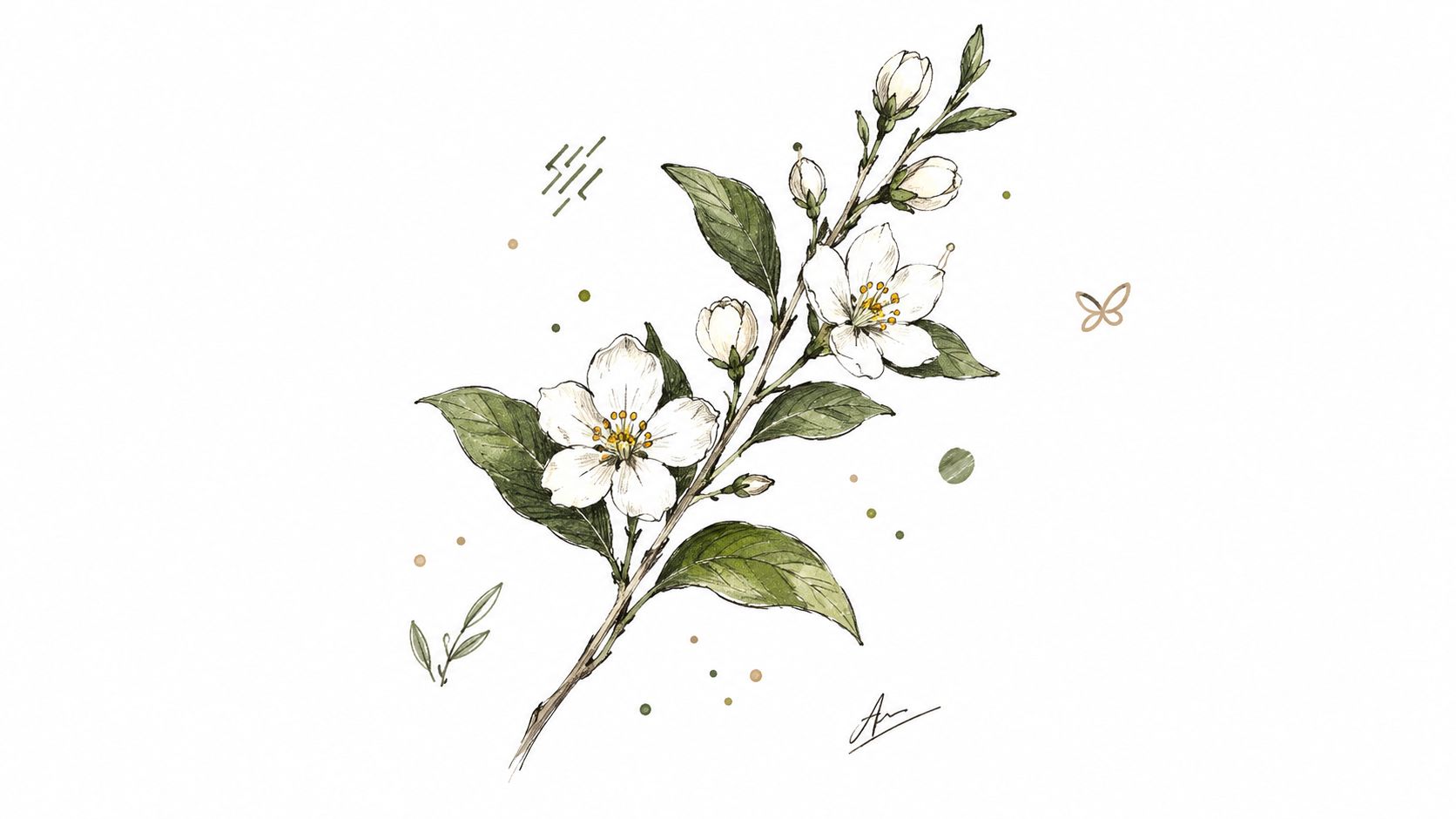
What often breaks this style is over-processing. If the hand-drawn effect looks filtered, buyers can tell. A scanned sketch, photographed watercolor, or a line drawn by hand can feel much more convincing than a digital brush that tries too hard to fake texture.
Keeping It Credible
I keep compositions simpler here than I would with cleaner digital art. Organic lines need space to breathe, and the whole piece looks better when I'm not crowding it with too much text or too many shapes. Consistent line weight also matters, especially if I want to build a collection that feels like it belongs together.
Trendlytic can help me check whether a given niche responds to organic art or prefers a sharper digital finish. That saves time, because some audiences want pristine geometry while others are drawn to visibly imperfect work. If I outsource the illustration, I'd rather pay for a style that's distinctive than settle for generic “handmade” decoration that could belong to anyone.
The decisive test is whether the piece feels like artwork first and product second. If it does, the shirt, tote, or print usually benefits from that restraint.
9. Inclusive And Representation-Focused Design
Inclusive design works when it feels honest, not like a brand trying to borrow credibility. I see this in body-positive fitness graphics, diverse family representation, disability-positive messaging, LGBTQ+ community work, and cultural celebration pieces. Buyers who care about representation can tell very quickly whether a seller understands the space or is just using it as a theme.
The best listings go beyond surface-level diversity. They make the message, wording, and community context match the visual. That matters because a diverse image with generic copy can still feel empty, and an empty product rarely builds trust.
I'd be careful not to claim authority I don't have. If a design speaks to a community I'm not part of, collaboration or direct feedback is better than assumption. That's also where cultural appropriation risk shows up, especially when symbols, clothing, or phrasing come from a group with a real lived history behind them.
What I'd Verify
- Community Fit: the language should feel like it came from inside the audience, not pasted onto it.
- Positional Honesty: buyers respond better when the seller is clear about perspective.
- Cultural Accuracy: symbols and identity markers need to be handled with care.
- Platform Demand: Trendlytic can help me compare demand and competition across representation niches before I commit.
This style can sell well because people like buying from shops that reflect them. It fails when the seller treats identity like a marketing aesthetic instead of a lived reality.
10. Interactive And Augmented Reality Design Concepts
Interactive work is still emerging, but it's interesting because it gives a physical product a second layer of use. QR code tees that point to a playlist or artist page, designs that reveal hidden content through scanning, and social-ready AR concepts all try to extend the product past the print itself. The idea is simple, the execution usually isn't.
I'd start small here. QR codes are easier to test than full AR features, and they're easier for buyers to understand right away. Full AR experiences can vary a lot by device and platform, so if the interaction is essential to the product, I'd expect more friction than with a standard design.
The best version makes the interactive layer optional, not required. The shirt or print should still stand on its own if the buyer never scans anything. That keeps the item from feeling gimmicky.
Buyers should understand the physical product first, then discover the digital layer as an extra.
Clear documentation helps here too. If the buyer doesn't know what the code does, what the scan reveals, or whether the experience expires, support issues start fast. Trendlytic can help monitor whether interactive niches are getting crowded before I spend time testing a concept that's already fading.
The video below is useful if I want to think through launch structure, but I still treat this style as experimental rather than core inventory.
10 Trending Design Styles Compared
| Design | 🔄 Implementation complexity | ⚡ Resource requirements | 📊 Expected outcomes | Ideal use cases | ⭐ Key advantages |
|---|---|---|---|---|---|
| Minimalist Typography & Quote Design | Low, simple layouts, focus on copy | Low, fonts, mockups, quick iterations | High shareability, steady niche sales but crowded | Apparel, niche communities, social posts | Fast to produce, low cost, emotionally resonant; 💡 trademark-check quotes |
| Retro & Vintage Aesthetic (80s/90s Revival) | Medium, era knowledge, authentic textures needed | Medium, color testing, distressed effects, references | Distinct identity, strong nostalgia appeal, long shelf life | Apparel, posters, lifestyle brands targeting nostalgia | Stands out in crowded categories, defensible with unique execution; 💡 test fabric color reproduction |
| Personalized & Customizable Designs | Medium–High, configurable templates, fulfillment rules | Medium–High, customer service, preview systems, variants | Premium pricing, high loyalty and repeat purchases | Etsy, gifts, weddings, pet/family commissions | Commands higher AOV, lower competition; 💡 be explicit about customization limits |
| Oversized & Statement Graphics | Medium, large compositions, placement proofing | Medium, high-res artwork, limited product suitability | High impact, social-media friendly, memorable pieces | Streetwear, full-front/back apparel, fashion-forward drops | Highly memorable and shareable; 💡 ensure very high resolution and test placements |
| Sustainable & Eco-Conscious Design Messaging | Medium, authenticity and supply-chain alignment required | Medium–High, eco materials, verified claims, sourcing | Loyal, values-driven customers, willing to pay premium | Eco brands, outdoor, activist audiences, sustainable shops | Builds brand trust and community when authentic; 💡 avoid vague claims (no greenwashing) |
| Anime & Manga-Inspired Designs | High, style accuracy and IP sensitivity | Medium–High, skilled illustrators, community research | Strong engagement and repeat buyers but high competition | Fan merch, conventions, niche anime communities | Large dedicated audience and high willingness to pay; 💡 create original characters to reduce IP risk |
| Micro-Niche & Hyper-Specific Designs | Medium, research-intensive targeting | Low–Medium, targeted keywords, small-run assets | High conversion and pricing power but limited scale | Intersectional niches (profession + hobby), insider communities | Minimal direct competition and high ROI per design; 💡 validate demand first |
| Hand-Drawn & Organic Illustration | High, requires true illustrative skill or commissioning | Medium–High, artist fees, time-consuming creation | Perceived as premium and authentic, differentiates brand | Art prints, boutique apparel, premium gift markets | Harder to copy, commands premium pricing; 💡 scan real hand-drawn work for best fidelity |
| Inclusive & Representation-Focused Design | Medium–High, needs consultation and cultural sensitivity | Medium, diverse assets, community input, review cycles | Loyal, engaged audiences and organic promotion if authentic | Family brands, social-justice audiences, community-driven products | Meaningful differentiation and strong loyalty; 💡 consult communities to avoid tokenism |
| Interactive & Augmented Reality (AR) Design Concepts | High, design + technical integration, cross-discipline work | High, developers, AR tools, device testing | Novel engagement and shareability, adoption uncertain | Tech-forward brands, entertainment merch, experiential campaigns | Differentiates brand and extends experience; 💡 start with simple QR experiences before full AR |
Turning a Trend Into Your Own Original Design
The question worth asking isn't which style looks current. It's which one fits your skills, your product choices, and your tolerance for risk. I'd pick one of these styles, study current bestsellers in that lane, and compare what's being repeated across shops before I launch anything. Then I'd run every title, phrase, and character name through a USPTO trademark check, especially when the design feels familiar enough to be tempting.
Product fit matters just as much as the art. A statement graphic might work on a tee but feel awkward on a tote. A personalized family design might sell on Etsy and feel weaker on a platform where buyers are looking for broad fandom energy. I'd test the design on the actual blank I plan to sell, not just on a clean digital mockup, because the fabric, print area, and color of the product all change the result.
I also wouldn't confuse trend research with originality. Trend data tells you where attention is concentrated, not whether your version is safe, better, or distinct enough to hold up in search results. That's why I like to check live bestseller data and trademark status side by side. Trendlytic can help with that across TeePublic, Amazon Merch, Redbubble, and Etsy, but the final call still belongs to the seller. For a broader approach to validation, I'd also compare it with Captapi's guide to trend validation and then make my own judgment from the market evidence.
If you're ready to turn one of these styles into a live product line, start with one niche, one blank, and one clear design direction. I'd use Trendlytic to check live bestseller data and trademark status before I publish, then refine the concept until it feels original enough to own.